With the experience of having built ABCKit and many hours of testing different apps for kids behind us, we have noticed some recurring app design problems.
For those working in this field, we would like to share some suggestions for designing and devising apps for children to help ensure the apps are correctly used by preventing some common design issues.
THE SPLASH SCREEN
If you’ve interacted with preschoolers (ages two to five), you’re aware that they do not quite grasp the concept of patience, especially when it comes to digital devices.
A splash screen that takes more than ten seconds to load will give rise to comments from kids such as, “Mommy, it doesn’t work.” They will get frustrated and lose their patience the first time they use the app.

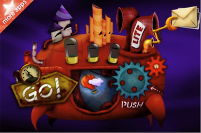
The Splash Screen for The Fantastic Flying Books of Mr. Morris Lessmore
Even though The Fantastic Flying Books of Mr. Morris Lessmore is an amazing app for young audiences, it takes between 24 and 28 seconds to load. But the soothing splash screen music keeps kids calm while the app finishes loading.
A splash screen is certainly necessary, as the app content needs to load before it can launch. But we should offer alternatives to this loading process to entertain kids while the app is loading; a puzzle or perhaps an animation could fill out this “waiting” process.
THE HOME SCREEN
An app’s home screen is generally not useful for children between one and three years of age (this changes from age four onwards). These children cannot read or write and do not yet know how to make the best decision when presented with several options.
In our usability tests we have noticed, for instance, that if a child wants to restart or resume a game, story, or activity, the child will not tap on the back button, which is designed to resume the game or revert back to the home screen. The majority of children press on the iPad’s or iPhone’s home button, causing the app to exit, and then look for its icon and launch it all over again.
This means that apps aimed at children between one and three years of age should immediately launch when they are opened, with no home screen or any other interstitial screens.
Kids Song Machine: A clear example of a simple and straightforward start screen.
For an app aimed at children aged three and above with different options to choose from, a plain and simple start screen can be used.
It is best to use very few buttons (three or four at most), maximize the size of the target tappable areas, and create the sensation of clicking so it feels like they are physically clicking on the buttons, which can help prevent possible mis-taps.
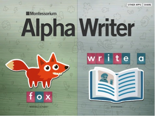
AlphaWriter by Montessorium home screen only has two large tappable areas with clear, concise, and meaningful drawings for children from ages four and over.
The Settings
We do not recommend settings buttons, as children often tap them accidentally. If an app has settings that require frequent configuration, they should be designed to be so simple that if the child accidentally changes them, it will not greatly affect the app’s performance.
The Wheels on the Bus app features a button on all screens to change the language or the song, or for kids to record their own voice. Even though children constantly touch them, these types of settings do not affect or determine the overall performance of the app. It is a good example of a non-intrusive setting.
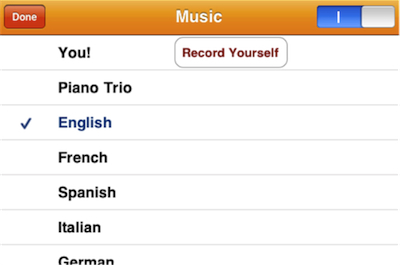
Settings of the Wheels on the Bus
From our perspective, settings are a function for parents, not for kids, so we recommend putting them in the device settings panel. Configurations can be made according to each child’s needs in the Applications Installed section. The frequency of and room for error can thus be reduced.
Interaction Design for Kids
Think big! Think enormous!
Look at any child’s toy truck. It’s enormous. And look at jumbo construction sets for preschoolers for instance; there isn’t a single small piece. Between 18 months and three years of age, children develop fine motor skills, so bigger is always better, particularly when it comes to designing apps.
Kids are drawn to large objects, especially if they are simple and easy to recognize.
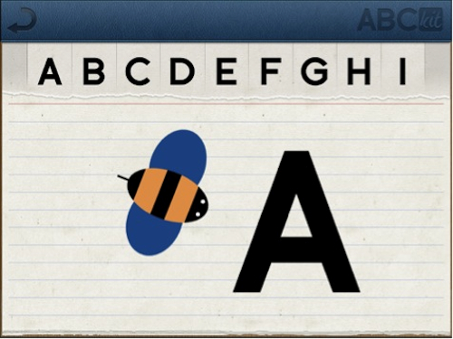
The “A” from “Abeja” (on Spanish) feature in the Know section of ABCKit for iPad
We observed a two and a half year old boy call the ABCKit app for iPad, “A de Abeja,” because the first thing he would always see and select on the screen is the first letter of the alphabet in the “Know” section of the app.
Easy tasks
Creating and developing easy tasks is the key to a successful app for kids.
Audio-visual enhancements that kids need in order to interact with the app should be obvious in the majority of cases, although, the sudden discovery of hidden features prompts kids to play and arouses curiosity in older children. This sudden discovery enhances the joy that preschooler kids need once in a while to delight their curiosity in fun ways and make them notice that there still some hidden areas waiting for be discovered.
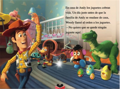
Toy Story for iPad
In Toy Story for iPad, small details such as the glowing light in the middle of the image give kids a clue that they can tap on the image and release new actions, such as hearing the voices of the characters or watching a short clip from the movie.
And even though designing to make tasks easy is nothing new to UX designers, in the case of children using tactile devices, ease-of-use rules and practices must be simplified and re-interpreted. When it comes to develop an app, not all of the patterns defined in guides like Touch Gesture Reference Guide can be followed. For instance, when a child holds an iPad with both hands, usually his fingers are touching one of the corners. When the child tries to tap another part of the screen to activate an action in the app (e.g., move an object, turn the page, etc) the application may ignore the action. This happens because the device interprets child’s hand holding the screen as a long tap, and does not execute the action being requested with the other hand.
There is a high probability that kids will unintentionally constantly touch the screen to hold the device, or will simply put their hands on it. Apps for kids should be much more forgiving with these types of gestures in order to function properly.
Challenge and reward
Kids respond to being praised and rewarded; positive words give them self-esteem and let them know that they are doing something well.
Games and challenges should offer positive feedback to let kids know they are moving forward. A clap, a word of appreciation, or just a smiling face indicating success will make the child happy.
In the ABC Alphabet Phonics for iPad app, every time kids tap on the correct letter, the app encourages them with phrases of positive reinforcement such as “Good Job” or “Awesome.”
Kids get bored with apps very quickly. Unless they feel entertained or are challenged to win a game, they just switch from one app to another.
It is very difficult for children between two and three years of age to follow a game. They expect to be guided by the app, and expect that every time they touch the screen something will happen and, in general, they have no interest in competition. Children between four and five years of age enjoy challenges, are focused, and can have a lot of patience if an activity is stimulating enough. They like the feeling of being challenged.
Children six years onward strive for perfection; their idea of fun is winning. They do not simply want to achieve the goal, they want to achieve it first, make no mistakes, and do it better than their peers—they want to be number one.
During our tests with ABCKit, kids aged five and a half and over would trace the letters again and again if they were not happy with the result.
Educational or Recreational?
In our opinion, apps for kids should be both educational and recreational; one does not exclude the other.
It is long-proven that learning should be fun for children. Fun develops the child’s innate ability to comprehend while learning because the fun enhances the natural curiosity that all kids are born with.
When children (and grownups, too!) do something for fun, they will do it a thousand times just for the joy of it, and that’s when learning happens. We learn and comprehend when we’re repeatedly exposed to specific stimuli and information.
Fun and learn should be always in the same context; if not, learning stops being natural (and fun), and it becomes merely teaching.
Do you have experience designing apps for kids? Would you share it with us? Please leave a comment.